
REDESIGNING PAPAYA GLOBAL KNOWLEDGE BASE
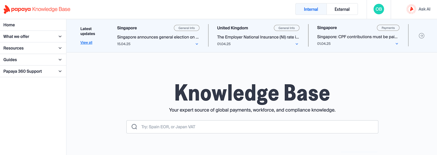
I co-led the redesign of the Papaya Knowledge Base to deliver a more seamless, intuitive user experience. The platform provides localized employment and payment insights, now fully integrated with the Papaya platform, and features "Ask AI" - a chatbot guiding users through compliance and workforce challenges.
Developed by: Dofinity
Client: Papaya Global
.png)
Redesigning Knowledge. Empowering Users.
(1) "Switching between the Knowledge Base and the main platform breaks my workflow."
The lack of integration made users jump between systems, leading to frustration and inefficiency.
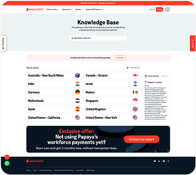
(2) Overwhelming Textual Content
Heavy blocks of information made it difficult for users to scan, absorb, and act on critical employment and payment details efficiently.
(1)
Frustration: Users waste time searching for information Business Risk: Lower platform engagement and client dissatisfaction
(2)
Frustration: Users feel stuck and overwhelmed Business Risk: Increased support tickets and slower client success
(3)
Frustration: Users struggle to scan and apply information Business Risk: Reduced knowledge base effectiveness and trust
- Centralized Search Focus
Reorganized the layout to establish a clear hierarchy and make the search bar the primary interaction point. - Reduced Button Overload
Minimized the number of side buttons to create a cleaner, more focused interface. - Enhanced Text Readability
Streamlined heavy text blocks to improve scanability and user comprehension
Close collaboration with the Performance Lead and the Knowledge Base Project Manager allowed us to shape a design that not only met operational needs but also streamlined content delivery and improved client usability.
Before
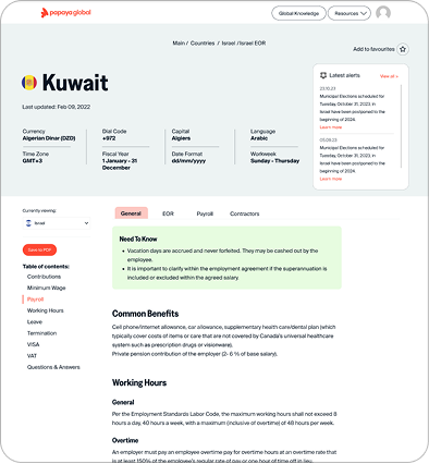
After
.png)
- Clearer content structure
Grouped country information into clean, scannable blocks instead of a flat list. - Streamlined navigation:
Improved side menu hierarchy and smoother tab transitions. - Reduced visual noise:
Minimized distracting elements like oversized buttons and alert boxes. - Enhanced text readability:
Better spacing, section separation, and more comfortable reading flow. - Consistent visual language:
Aligned typography, colors, and layout with Papaya Global’s platform standards.
The redesign had a measurable impact on user behavior and platform efficiency:
- 27% reduction in unnecessary clicks Clicks dropped from 80,000 in January to 58,262 in April, indicating that users were finding information more quickly and navigating more efficiently.
- Sustained high engagement
Despite the drop in clicks, the average session length remained stable at 5–6 minutes, showing that users stayed engaged with the content and navigated with greater intent.
These results highlight a significant improvement in user flow, content accessibility, and overall platform usability.
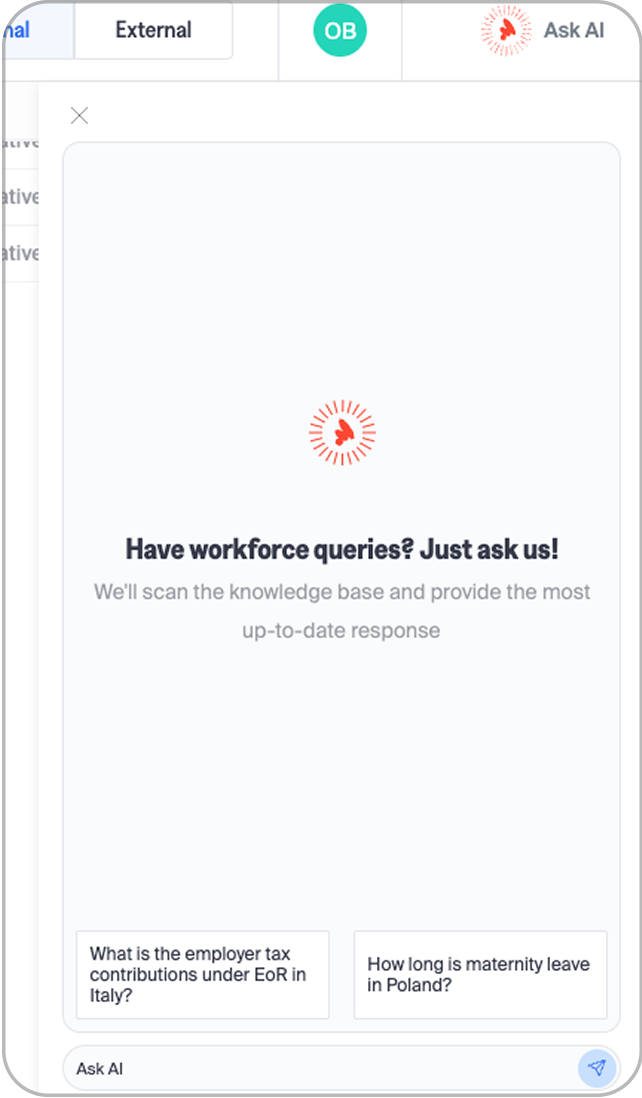
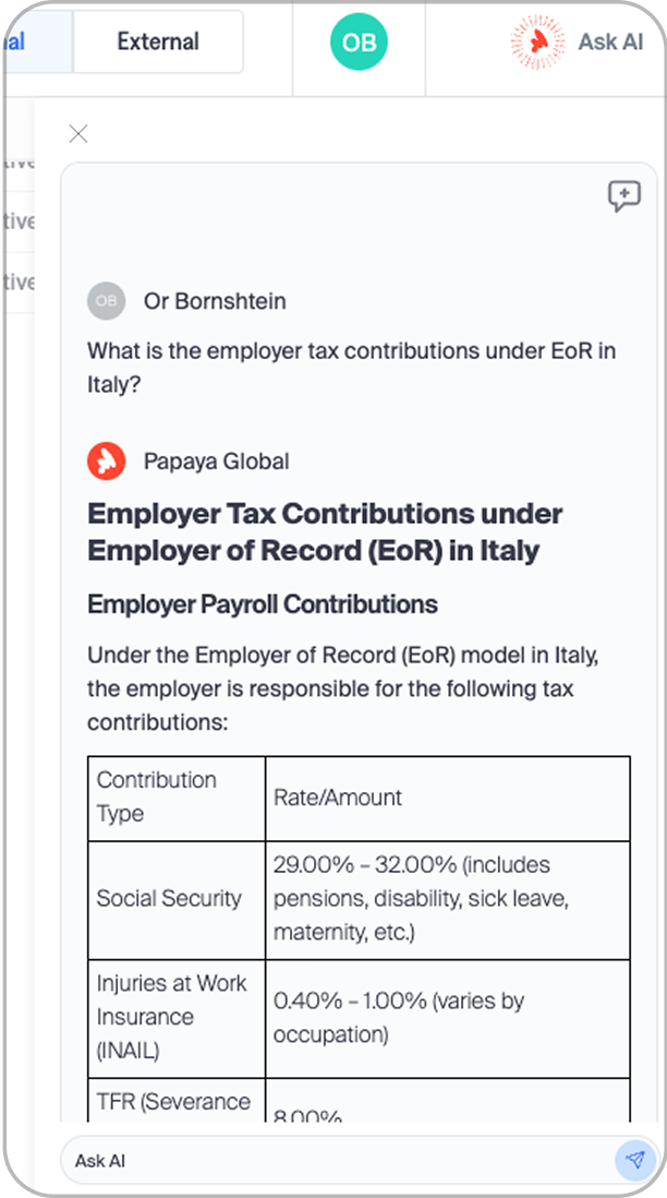
Launched Ask AI, an assistant helping users find answers and navigate complex topics faster.
.png)
Making Knowledge More Accessible
Looking ahead, a more proactive Ask AI could surface the right answer before users search, while role-based, multilingual content makes global payments and compliance knowledge easy to reach for any team, anywhere.
